“Nothing is more abstract than reality.”
- Giorgio Morandi (1890 -1964)
For our fourth Viewing Room we invited gallery artist Possible Mirror to make a personal selection of works on paper.
The nine chosen works are all abstractions reflecting this particular influence on the mirrors.
Possible Mirror has also provided some brief remarks regarding each of the nine works.
All the works featured in this Viewing Room are available for purchase and may be viewed in Spitalfields, London or Monmouth by appointment.
-
Blow, Hoyland & Frost
Three artists who were seen as pioneers of abstraction in twentieth century British art. Colour, composition and mark making are pushed to the fore.
Sandra Blow places a freely drawn, deep purple, asymmetric grid within a contrasting precise square - a single line of the grid breaks the perimeter at the bottom left. Both the square and grid act as a window through which arcs and blocks of orange, red, blue and green can be seen. A sense of space is introduced by this juxtaposition and by the relationship between the colours as they sit in on the picture plane. This work is a fine example of the medium of screen printing making use of flat, dynamic colour.
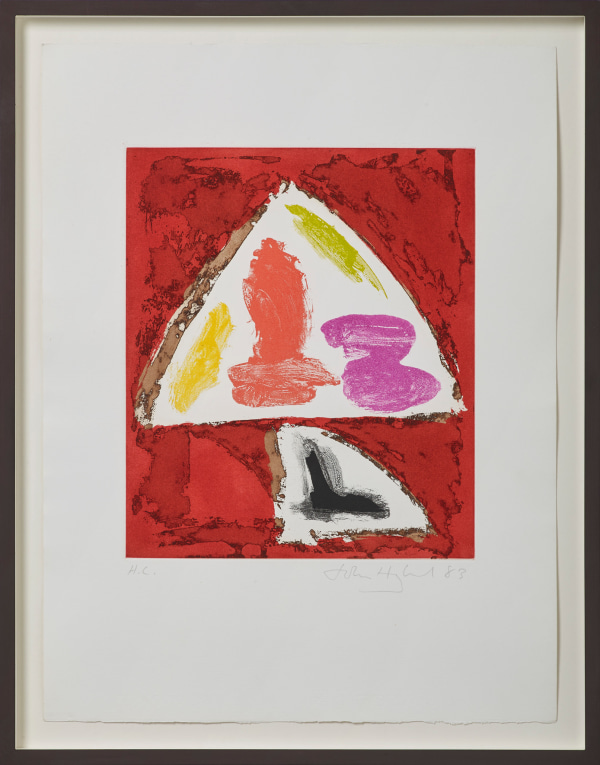
In his etching Tiger's Pupil John Hoyland captures a real sense of his large abstract paintings. A large white triangular form balances atop a smaller curved quadrant, both are set against a deep blood red background. Within the white triangle are gestural, suggestive marks in four more colours which interact with each other in a satisfying way. In contrast the base shape has within it a single black, brushed angle which acts as an anchor for the whole composition.
This fine print, Tree Forms - Blue, by Terry Frost is suggestive of Matisse, particularly the late cut-out works. Here a repeating motif of stylised tree trunks and blue leaves moves laterally across the paper, like the frames of a film. At the centre of the composition he introduces three more colours, a yellow, pale orange and purple. This both enlivens the print, stopping it from simply behaving like a pattern, while also suggesting a shift in time – the leaves turning in colour with seasonal change.
-
The Abstracted Landscape
-
Rae, Heron & Blackburn
These three works share a preoccupation with colour and marks, reducing the landscape to essential elements while still referring to particular places.
Barbara Rae makes use of very bold colour in her silk-screen Inishkeas while also giving a feeling of texture. A curving lime green line and red zig-zag seem to lead us into the space, there is a suggestion of a bordered pathway. The red zig-zag is also echoed at the top of the print. Turned horizontal and placed against lilac this now evokes distant mountains. However, there is no perspective in this print. The use of colour makes the space very shallow - the foreground and distant sky are both the same deep yellow.
Patrick Heron’s print Shapes Of Colour has been reduced to its essentials in order to draw attention to the interlocking, colourful mark making. While Rae and David Blackburn both retain a sense of the observed landscape, Heron has reduced a Cornish view into two sets of irregular, flat shapes of colour. There is a sense of looking down at something static in the first print while the second evokes movement – perhaps tumbling rocks. In both prints he allows the viewers imagination to fill in the gaps.
David Blackburn’s Landscape Near Canberra is closer in spirit to the Barbara Rae, but his approach is quite different. This work has a limited sense of colour, recalling red Australian sandstone. We also have a sense of literally looking through the landscape like a geological section. The lines of this pastel on paper suggest strata and fault lines, while formally they also recall the great Ocean Park series by the American West Coast painter and printmaker Richard Diebenkorn.
-
Points of Contact
-
Ousey, Hambling & Pasmore
Harry Ousey used simple elementary shapes, circles and lines, in a manner that reminds me of the ink and brush drawings by the Japanese masters. The colour in this work is restrained - black, pale yellow, burnt orange and muddy browns. The black lines dominate and he added interest by varying the lines, they taper and he contrasts thick and thin. With his expressive brushwork he builds a little, quiet drama of still confrontation – there is a lovely tension in this work.
Maggi Hambling’s Laugh is large watercolour and gouache suggesting a presence which hovers between matter and something more ethereal and fleeting. The paintings pink tones seem to recall both a rose tinted light and something corporeal such as lips. The use of the medium and paper is exploited to the full with washes, drips, and bleeding pigment all essential elements in the final composition.
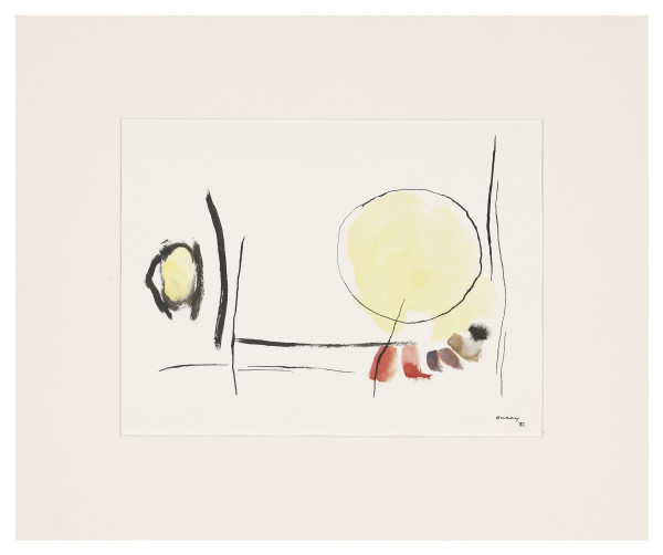
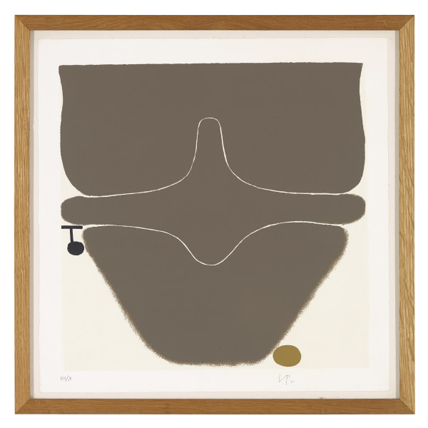
Points of Contact by Victor Pasmore features a form which has become a leitmotif within his work. The shape resembling a vertebrae cross section, also appears in numerous paintings from this period. I like the way this form interlocks with the softer curved shapes above and below while exploiting the white of the paper. Two smaller forms balance the composition in place - a black stave like device on the left and a small ochre ovoid at the base. Their hard edges contrast with the blurred, soft outline of the base. The form also suggests a tumulus, that is a burial mound, an impression reinforced by the earth brown ink he used for the print.
-

Frame I (after Mangold). Unique mirror, acrylic on wood and panel with bronze tinted mirror